Reblogs for 20100816
Reblogs for 20100813
- Photo
- Photo
- Foundation elements for modern businesses
When you sit down to dream up a new business, you can imagine a world without constraints. Or you can choose to build in fundamental pieces that will make it more likely your idea will pay off.
Here are some fundamental pieces of most new successful businesses. The goal is to build these elements into the very nature of the business itself, not just to tack them on. For example, the Scotch tape people at 3M can’t do #5, because of the structure of retail distribution and the way they mass produce and can’t track who is buying what.
You can live without some of these, but go in with your eyes open if you do:
- Build in virality. Consider: Groupon.
- Don’t sell a product that can be purchased cheaper at Amazon.
- Subscriptions beat one-off sales.
- Try to create an environment where your customers are happier when there are other customers doing business with you (see #1).
- Treat different customers differently.
- Generate joy, don’t just satisfy a need for a commodity.
- Rely on unique individuals, not an easily copyable system.
- Plan on remarkable experiences, not remarkable ads.
- Don’t build a fortress of secrets, bet on open.
- Unless there’s a differentiating business reason, use off the shelf software and cheap cloud storage.
- The asset of the future is the embrace of a tribe, not a cheaper widget.
- Match expenses to cash flow–don’t run out of money, because it’s no longer 1999.
- Create scarcity but act with abundance. Free samples create demand for the valuable (but not unlimited) tier you offer.
- Tell a story, erect a mythology, walk the walk.
- Plan on obsolescence (of your products, not your customers).
Notes:
3. The cost of selling a subscription to your product or service is not a lot higher than the cost of selling just one, but you benefit by having sales you can count on at low cost. Your customers benefit because you depend on them more and they save time.
5. Everyone has different needs and expectations and resources. The internet lets you tell people apart and give them what they need.
7. AKA as Linchpins.
9. If you’re building a business on trade secrets or lack of information among your customers, you’re trying to fill a leaky bucket. Far easier to bet on the more people know, the better you do.
10. Because cheap software and the cloud are going to continue to get cheaper, and custom work that’s worth anything is going to continue to get more expensive.
12. The best people to fund your growth are your customers.
13. When the marginal cost of an interaction approaches zero, you benefit by creating plenty of them.
14. We can tell.
Reblogs for 20100813
- 15 Pieces of Papers Under Creative Commons License (Attribution Non-Commercial Share Alike)
Naoyoshi Hikosaka, contemporary artist, decided to put together a show called the Free Art Exhibition so I decided to participate.
The exhibiting art works must be free to give away.
It wasn’t easy to think of free art using the old technology which can not be digitally copied. As a proud member of Tokyo F.A.T., I wanted to create something symbolic!
So here is what I did. First I designed a symbol with CC license marks and its meta data (see SVG data here), pressed it on 15 real bills, and of course signed my name on each of them. In a way, copy-lefted the bills. I own the author’s copyright of the bills and at the same time they are completely free!
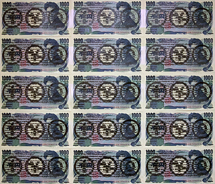
I completed the work by lightly gluing the bills on a canvas.
Anybody can take it and leave. I also exhibited the stamp it self so that anybody can stamp it on his money or on himself.If you want to make your own money in your own country, the idea is for free.
The Exhibition is until the 22th of August.
“15 Pieces of Papers Under Creative Commons License“
by Seiji Ueoka, F.A.T. Tokyo
2010 - Stilla

Stilla
Reblogs for 20100808
Reblogs for 20100805
- Tips for creative success from Pixar
Randy Nelson is Dean of Pixar University and gives a really nice 9-min talk below with important content for all professionals and students. The talk is called Learning and Working in the Collaborative Age. Pixar is the kind of company that focuses hard on the development of its people, and Nelson is someone who has a lot of experience helping very creative people communicate and collaborate better. I like the way Nelson expresses his ideas on stage and connects with his audience at this Apple Education Leadership Summit, but it’s his ideas that are really the takeaway here. Below the video, I summarize some of his key points for your review.
Improv and collaboration
Pixar uses improv as a mechanism of collaboration. Here are two valuable lessons from improv.
(1) Accept every offer. Don’t judge it, you’ll stop it. It becomes a dead end if you judge it, but unlimited possibilities if you go with it.
(2) Make your partner look good. When you know others will try to make your idea better, not just shoot it down, you become free. And you too have the opportunity “to plus” any idea that is put forth. The idea of “plus-ing” means not to say that the idea (or thing) is bad or wishing it was something else, but to accept it as the starting point and make it even better. This is sort of zen in a way: accept it for what it is — right here, right now — and then try to make it better (to make your partner look good).
Then Randy Nelson goes on to touch on the kind of person they are looking for at Pixar.
What should we be looking for?
• Depth of knowledge/skill in a particular area is important, obviously. But then how do you hire someone for something that has never been done before? So past success alone is not enough as this may also include the absence of failures as much as anything else.
• Failure and recovery. Depth is important, but not the differentiator; lots of people can point to a successful, deep resume. It’s not about simply avoiding failure but the experience of seeing failure first hand and then rising above it. “The core skill of innovators is error recovery not failure avoidance,” says Nelson. Resilience and adaptability in solving real problems is key.Aptitudes for success in a creative world
(1) Mastery of subject (depth). “Mastery in anything is a really good predictor of mastery in the thing you want done,” says Nelson. A true master at something is going to be the kind of person with characteristics that you can use in your organization. “That sense of ‘I am going to get to the top of the mountain’ separates them from all the other candidates almost instantly.”
(2) Breadth of knowledge, experience, and interests. You do not want narrowness which sometimes comes with depth. “We want people who are more interested than interesting,” says Nelson. A curious, interested person can be a good collaborator because they are not merely consumed with themselves but are deeply interested in the world outside of themselves. “They want to know what you know. They want to know what is bothering you.” An “interested” person amplifies others.
(3) Communication. An interested person with breadth has good empathy, an aptitude critical for good communication. A good communicator leans in to listen because they are interested. Communication, says Nelson, also involves translation. That is, having the ability to “translate” your idea into messages that others outside your field (or perspective and experiences, etc.) can understand. A breadth of knowledge and experience should make it easier for someone to translate their own ideas at the sending end so that the message does not have to be translated at the receiving end. Communication actually happens only when the receiver understands; it’s not enough for the sender to think he is communicating. “Nobody can declare themselves as being articulate, but a listener can say, ‘yes, I think got that, I understand what you mean.'”
(4) Collaboration. Cooperation is not the same thing as collaboration. Cooperation is just that thing “which allows you not to get in the other’s way,” says Nelson. Collaboration means amplification. In Collaboration you have people with depth and breadth and a drive and ability “to communicate on multiple different levels: verbally, in writing, in feeling, in acting, in pictures…and finding the most articulate way to get a high fidelity notion across to a broad range of people….” so that all on the team can contribute. I think of collaboration as being like 2+2=5 (or 137, etc.).Collaboration and education
There are lessons to be learned from Pixar. Depth is necessary but insufficient. The importance of breadth and communication and collaboration skills cannot be overstated. And yet, when you look at formal education it seems like we discourage breadth. “Don’t study art,” they say. “You’ll never get a job in that!” Communication skills are under appreciated “soft-skill” areas, and collaboration is rarely mentioned at all. I am certain that I never heard the word “collaborate” in high school. “Cooperate” was our instruction always, and we were rewarded for it, rewarded for getting along and not “causing trouble.” Perhaps today the notion of collaboration is being taught more in schools. Collaboration is hard because it requires mastery, breadth, empathy, and solid communication skills. But collaboration is more critical now than ever before. Are our education systems prepared for it?
H/T @SirKenRobinson
- Hakim Experiments [Scripts, HMTL5]
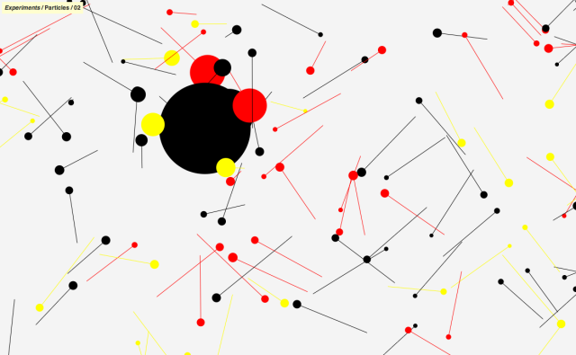
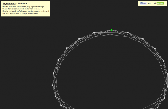
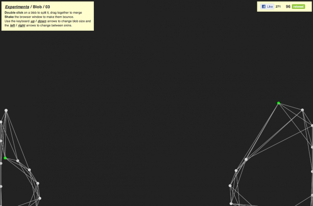
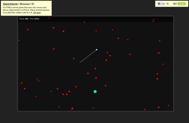
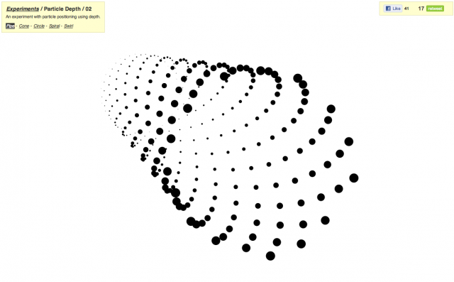
This is the personal playground of Hakim El Hattab, exploring what is possible using HTML5 and Canvas. Most recent addition includes Sinuous, a simple game built using canvas which will test your mouse pointer reflexes by having you direct your cursor against incoming meteors. My other personal favourites include Blob, Magnetic, Particle Depth and Particles.
Head over to hakim.se/experiments for some awesome HMTL5 fun or play with the code here.. Looking forward to see what’s next…
Hakim Experiments [Scripts, HMTL5] is a post from: CreativeApplications.Net | Follow us on Twitter – Facebook – Flickr – VimeoRelated Posts:
- Harmony [WebApp]
- the389 [Javascript]
- Multiuser Sketchpad [WebApp]
- 0to255 [WebApp]
- Pixuffle [WebApp, Photography]
- Temporary.cc [WebApp]
- Cartoon Network Enters the Grid
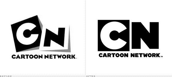
Launched in 1992 by Atlanta-based Turner Broadcasting, the Cartoon Network was a godsend to, well, cartoon lovers with 24-hour cartoon programming, mostly re-runs. In the past few years, with original series and its hipster- and geek-attracting Adult Swim block in the wee hours of the night, Cartoon Network (CN) has become one of the most attractive and genuine channels on television. From its humble beginnings, CN is now broadcast in 166 countries. But its identity has been a little wobbly in the last two years or so with an initial switch from the well-known checkerboard logo to a short-lived, perspective acronym that, I’m guessing, didn’t fair too well as it just got shelved earlier this year when CN started to run a new on-air identity in May, designed by animation powerhouse Brand New School in collaboration with the talented in-house team at CN. This week a new range of on-air identity applications started to roll out.
The network chose to embrace its brand visual heritage of the black and white checkerboard by imbuing it with new meaning, and the artists and producers of BNS were able to bring this idea to life in a fresh, compelling way using dimension, color and movement. All the new design elements began appearing in late May, and the new on-air IDs premiered on the network this week.
“Our brand expansion represents our commitment to delivering a breadth of content that our audience cannot find anywhere else,” said Senior Vice President of Creative Direction, Michael Ouweleen. “The checkerboard is in our DNA and is not only reflected in the subtle redesign of the logo but also provides a through line that connects and helps frame our diverse slate of programming from animation to live-action. The art direction and creative acumen of the Brand New School and their ability to breathe new into the iconic was invaluable and helped us achieve our goal.”
— Press Release
The before-before logo, with the well-known checkerboard design.
“CHECK it” tagline and lock-up with logo.
When I first saw the perspective logo submitted as a tip I didn’t post it because, even at that time, I felt like it was maybe just a “phase.” There didn’t seem to be longevity attached to it. What I didn’t like about it is that it screamed “Cartoons!” whereas the old and new ones are just identifiers for the cartoons themselves, they don’t have to act like cartoons. So it’s very nice to see CN pull back and go back to what made the original logo more successful. There are no magic revelations in the new logo. It’s the old “C” and “N” pulled out of the original, blown up and put side to side. Simple.
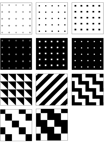
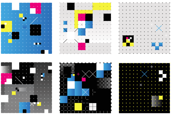
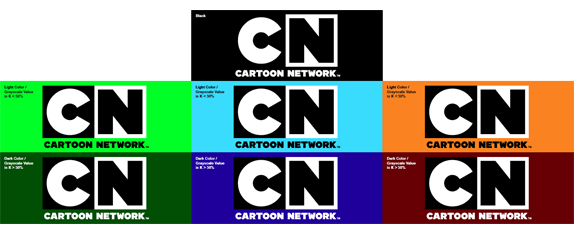
Black-and-white and color patterns.
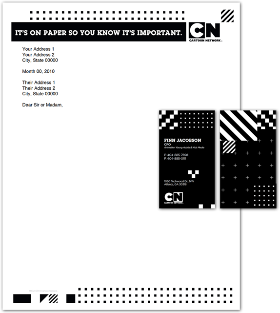
Stationery.

Show icons.

Lifestyle icons.
The new identity is surprisingly basic in its visual elements: CMYK colors, dots, crosses, squares, a grid. Yet the applications are playfully complex and versatile. Giving CN a broad range of possible executions without feeling too repetitive.
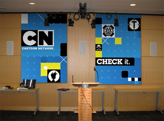
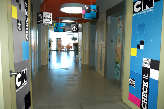
Office application renderings.
And when it comes to the visual pyrotechnics of on-air animation… good luck getting bored by it.
“Because we’d created such a gridded and structured designs for the overall approach, it became imperative that the movement of these pieces felt snappy, fast-paced, and above all, playful and full of life,” said Calvert. “Our animators developed a language that’s rooted in familiar physical interactions, but caricatured and amplified into something incredibly captivating and energetic.”
— Press ReleaseMontage from Cartoon Network’s 2010 On-Air Brand Expansion from Brand New School on Vimeo.
- New solar energy conversion process could reduce the costs of solar energy production enough for it to compete with oil
Stanford University engineers have figured out how to simultaneously use the light and heat of the sun to generate electricity in a way that could make solar power production more than twice as efficient as existing methods and potentially cheap enough to compete with oil.
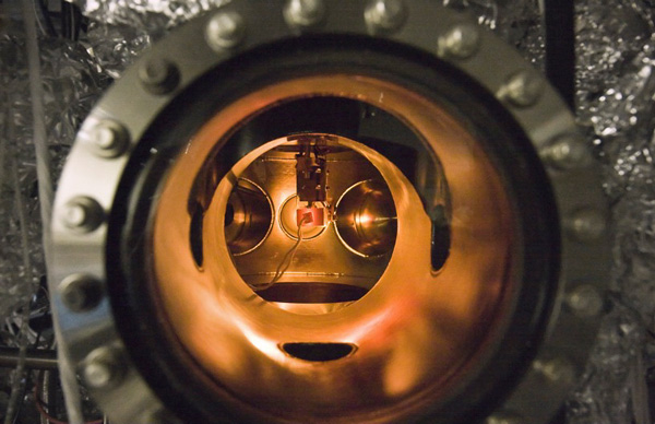
A small PETE device made with cesium-coated gallium nitride glows while being tested inside an ultra-high vacuum chamber. The tests proved that the process simultaneously converted light and heat energy into electrical current.
Called “photon enhanced thermionic emission,” or PETE, the process promises to surpass the efficiency of existing photovoltaic and thermal conversion technologies.
Most photovoltaic cells, such as those used in rooftop solar panels, use the semiconducting material silicon to convert the energy from photons of light to electricity. But the cells can only use a portion of the light spectrum, with the rest just generating heat.
This heat from unused sunlight and inefficiencies in the cells themselves account for a loss of more than 50 percent of the initial solar energy reaching the cell.
If this wasted heat energy could somehow be harvested, solar cells could be much more efficient. The problem has been that high temperatures are necessary to power heat-based conversion systems, yet solar cell efficiency rapidly decreases at higher temperatures.
Combining light and heat could almost triple efficiency
A group headed by Nick Melosh, assistant professor of materials science and engineering, figured out that by coating a piece of semiconducting material with a thin layer of the metal cesium, it made the material able to use both light and heat to generate electricity.
Melosh is senior author of a paper describing the tests the researchers conducted. It was published online Aug. 1 in Nature Materials.
“What we’ve demonstrated is a new physical process that is not based on standard photovoltaic mechanisms, but can give you a photovoltaic-like response at very high temperatures,” Melosh said. “In fact, it works better at higher temperatures. The higher the better.”
Melosh calculates the PETE process can get to 50 percent efficiency or more under solar concentration, but if combined with a thermal conversion cycle, could reach 55 or even 60 percent – almost triple the efficiency of existing systems.
“The PETE process could really give the feasibility of solar power a big boost,” Melosh said. “Even if we don’t achieve perfect efficiency, let’s say we give a 10 percent boost to the efficiency of solar conversion, going from 20 percent efficiency to 30 percent, that is still a 50 percent increase overall.”
And that is still a big enough increase that it could make solar energy competitive with oil.
The research was largely funded by the Global Climate and Energy Project at Stanford and the Stanford Institute for Materials and Energy Science, which is a joint venture of Stanford and SLAC National Accelerator Laboratory, with additional support from the Department of Energy and the Defense Advanced Research Projects Agency.
More info: Stanford University news
- Eric Schmidt: Every 2 Days We Create As Much Information As We Did Up To 2003
Every two days now we create as much information as we did from the dawn of civilization up until 2003, according to Google CEO Eric Schmidt — about five exabytes of data.
He cautioned that just because companies like his can do all sorts of things with this information, the more pressing question now is if they should. Schmidt noted that while technology is neutral, he doesn’t believe people are ready for what’s coming.
“I spend most of my time assuming the world is not ready for the technology revolution that will be happening to them soon,” Schmidt said.
- Market Data Firm Spots the Tracks of Bizarre Robot Traders
Nanex, the data services firm, has discovered mysterious and possibly nefarious trading algorithms are operating every minute of every day in the nation’s stock exchange. Unknown entities for unknown reasons are sending thousands of orders a second through the electronic stock exchanges with no intent to actually trade.
Often, the buy or sell prices that they are offering are so far from the market price that there’s no way they’d ever be part of a trade. The bots sketch out odd patterns with their orders, leaving patterns in the data that are largely invisible to market participants.
The company’s software engineer Jeffrey Donovan thinks that the odd algorithms are just a way of introducing noise into the works. Other firms have to deal with that noise, but the originating entity can easily filter it out because they know what they did. Perhaps that gives them an advantage of some milliseconds.
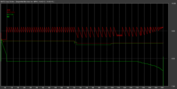
Software engineer Jeffrey Donovan stared and stared at the data. He began to think that he could see odd patterns emerge from the numbers. He had a hunch that if he plotted the action around a stock sequentially at the millisecond range, he'd find something. When he tried it, he was blown away by the pattern. He called it "The Knife." (Nanex)
- Blippy Has Pretty Much The Best 404 Page Ever. What Does It Mean?
<
Creating 404 pages (the error page you get when a page on a site cannot be located) has become something of an artform. Startups can earn major bonus points in the geek community for having a humorous one. And Blippy has just tapped a perfect meme for their’s.
As you can see here, Blippy’s 404 page features a glorious rainbow. And while it’s not exactly a double rainbow, the cute unicorn child creature seems to think it may be. “What does it mean…,” he wonders.
Well if you click on him, you can find out…
It’s a double rainbow all the way!
Keep clicking…
OMG A TRIPLE RAINBOW!
As a sidenote, some people may think Twitter has the most famous 404 page these days with the Fail Whale. But that’s not actually a 404 error. Technically, the Fail Whale is a 503: Service Unavailable, error. The Twitter 404 page is much less exciting (below).
Reblogs for 20100804
- How caloric restriction and exercise delay some effects of aging
Harvard University researchers have uncovered a mechanism through which caloric restriction and exercise delay some of the debilitating effects of aging by rejuvenating the connections between nerves and the muscles that they control.
The research, conducted in the labs of Joshua Sanes and Jeff Lichtman, both members of the Center for Brain Science at Harvard and professors of molecular and cellular biology, begins to explain prior findings that exercise and restricted-calorie diets help to stave off the mental and physical degeneration of aging.
Their research, conducted through laboratory mice genetically engineered so their nerve cells glow in fluorescent colors, shows that some of the debilitation of aging is caused by the deterioration of connections that nerves make with the muscles they control, structures called neuromuscular junctions. These microscopic links are remarkably similar to the synapses that connect neurons to form information-processing circuits in the brain.
In a healthy neuromuscular synapse, nerve endings and their receptors on muscle fibers are almost a perfect match, like two hands placed together, finger to finger, palm to palm. This lineup ensures maximum efficiency in transmitting the nerve’s signal from the brain to the muscle, which is what makes it contract during movement.
As people age, however, the neuromuscular synapses can deteriorate in several ways. Nerves can shrink, failing to cover the muscle’s receptors completely. Sanes said the intersections between the nerves and muscles can go from a continuous network that looks like a pretzel to one that resembles a bunch of beads — broken into discontinuous individual lumps, interfering with transmission of nerve impulses to the muscles. This loss of activity can result in wasting and eventually even death of muscle fibers.
The work showed that mice on a restricted-calorie diet largely avoid that age-related deterioration of their neuromuscular junctions, while those on a one-month exercise regimen when already elderly partially reverse the damage.
“With calorie restriction, we saw reversal of all of these things. With exercise, we saw a reversal of most, but not all,” Sanes said.
Because of the study’s structure — mice were on calorie-restricted diets for their whole lives, while those that exercised did so for just the month late in life — Sanes cautioned against drawing conclusions about the effectiveness of exercise versus calorie restriction in preventing or reversing synaptic damage. He noted that longer periods of exercise might have more profound effects, a possibility he and Lichtman are now testing.
The research was published online by the journal Proceedings of the National Academy of Sciences and financed through grants from the National Institute on Aging, the National Institute of Neurological Disorders and Stroke, and the Ellison Medical Foundation.
Beyond the ease of study, neuromuscular junctions are important areas to understand because the gradual loss of muscle mass and strength, known to scientists as sarcopenia, is a problem in the elderly, debilitating otherwise healthy individuals who can lose their balance and break a hip or other bones, leading to a cascade of physical ills.
While the changes to the synapses through caloric restriction and exercise were clear in the images the researchers obtained, Sanes cautioned that their work was structural, not functional, and they have not yet tested how well the synapses worked.
More info: Harvard University news
Reblogs for 20100803
- Huge blasts of sun’s plasma hurtling toward Earth
- photojojo:
Sandrine Estrade Boulet’s photos are a different…

Sandrine Estrade Boulet’s photos are a different kind of street art.
She photographs seemingly ordinary objects strewn about the city sidewalks and later brings them to life with clever illustrations!
Reblogs for 20100731
- Happy SysAdminDay
The world celebrates the 11th SysAdminDay today. To all the users out there: This is a nice opportunity to thank your admin staff for doing migrations at night to keep your business running at day, for making seemingly impossible requirements possible, for keeping the systems up and running, for answering your questions, that would be able to answer yourself with google in the time you need to pick up the phone

And keep in mind, your admin would do everything for you to restore the operations of your datacenter:

Reblogs for 20100731
- Exclusive: I Used BlindType, Virtual Keyboard of the Future
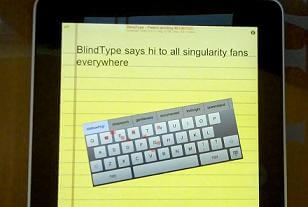
Typing on the iPhone is like squeezing sausages into a soda can – you can get it to work, but it’s not pretty. BlindType is changing that. The startup has created a new touchscreen keyboard program of the same name that changes size, orientation, and position to match your wandering fingers as they type. BlindType also features some of the most impressive typing correction software I’ve ever seen. The result is a practical touchscreen interface that knows what you meant to type, even if you make mistakes. Lots of them. In fact, you can type without looking at the screen at all! It’s amazing, and I got to see it in person when I visited with BlindType creators Kostas Eleftheriou and Panos Petropoulos in San Francisco. Check out their demonstration video below. It’s hard to believe that they developed this software in less than one year.
Because BlindType is still under development Kostas and Panos would only let me take still shots of the program. Yet as you can see in their public demo video, BlindType lets the user be sloppy. When I tried the program on an iPad I could relax about mistakes. Not in spelling, but in the actual way I actually tried to hit keys on the touchscreen keyboard. Do you have fat fingers like me? Not a problem. Do your hands migrate slowly as you type? It can handle that too. Hold your iPad to one side, type in progressively larger or smaller movements, even ditch the keyboard altogether. BlindType can deal with it all. Just watch and learn:If you found the above demonstration for BlindType impressive, you’re not alone. The video received more than 300,000 hits in its first week. Those are great numbers for a tech demo from a startup on YouTube. Kostas and Panos were so impressed with the positive response they even created a follow up thank you video:
Why all the hullabaloo? BlindType is easing one of the biggest fears people have about touchscreen interfaces: they don’t trust a keyboard without feedback. BlindType doesn’t let you feel the letters but it does give you a lot of confidence in your typing. Kostas and Panos wanted a system that assumed the typist knew what they were doing. If you type one letter on the right, another on the left, and you don’t directly hit the keys, BlindType tries to figure out what you meant to hit. Sometimes it can surprise you. Kostas and Panos dared me to see how poorly I could type and still have the right word appear. I typed without really looking at the keyboard and entered something like “ubvunvryjankt”. BlindType knew I meant “inconceivable”. I was amazed. Kostas and Panos laughed, they get that all the time.
That’s when I really felt challenged and I tried my absolute damnedest to defeat BlindType. I’m glad I did. I learned how robust the system is. We turned off the keyboard. It didn’t appear on the iPad screen at all. I typed in different directions, different speeds, and randomly changed the space I put between the letters I was trying to type. BlindType handled it all with relative ease. When I entered in new words the program didn’t know (like my last name), a little menu popped up letting me store them in a custom dictionary with just one touch. Easy.
Of course it’s not perfect. As Kostas and Panos helped me see, the program has limitations. BlindType is a typing correcter, not a spelling correcter. If you mistype a word by adding or subtracting a lot of letters, it doesn’t work well. It comes with a spell-checker/auto-correction feature (or it will) but don’t expect it to perform wonders on both typing and spelling simultaneously. It’s good, but there’s only so much decoding that’s mathematically possible.
There’s also limitations on the physical side of things. You have the choice of leaving the spacebar enabled or disabled. If you enable it, then there’s a fixed point on an otherwise unfixed keyboard. That means you have to actually hit the spacebar button where it’s supposed to be – that’s not always easy if you’re typing sloppily. If you disable the spacebar then spaces are inputed by swiping left to right. That’s a reasonable adaptation to ask of a user, but it takes a little getting used to.
And Kostas and Panos are still working out how to get the program to differentiate between very fast typing and swiping. So if you type as fast as you possibly can sometimes the program thinks that two letters next to each other was actually you trying to make a swiping motion. Same with resting your fingers on the touchscreen – right now the program thinks you are trying to make a long swipe. Panos said they could solve that pretty easily in the future.
More limitations? Sure: if you have to swipe left to right, then as you rotate the phone (or iPad) you have to be careful about what direction it considers left to right. There’s a little arrow to help you keep track of this, and the program reorientates itself after every new word, but you can, if you’re nasty, confuse BlindType by typing things upside down or backwards (I told you I felt challenged). Most users aren’t going to intentionally try to cause a failure though, so this is a very minor limitation.
All in all, I was simply blown away by how BlindType transformed me from a timid typist into a bold keyboard-challenging beast. I was so confident in the program’s skills (in just a few minutes of using it!) that I was typing super sloppy and expecting the best. And I got it the vast majority of the time.
With the product being so sound, I was naturally interested in how it worked, and how they developed it. That’s when Kostas and Panos got very tight-lipped. They’ve received so much attention, from apparently some big name people, that they can’t discuss anything. They won’t even generally describe how BlindType approaches the problem. I guessed it was analyzing the relative position between finger taps and they just gave me their best poker faces. No revelations at all. Kostas did allude to the fact that this is an AI project…but not much was said beyond that.

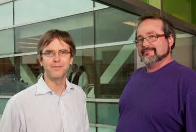
Panos Petropoulos and Kostas Eleftheriou are cousins from Greece. They conceived and created BlindType in less than a year. What have you been up to recently?
And BlindType is a small company, so there’s little chance that the secrets will leak out. In fact, BlindType really just has two employees: Kostas and Panos – cousins from Greece. Though they’ve had help with testing and such, the two of them essentially developed this program on their own. That floored me. How long did it take them to create it? A few months! Though Panos admitted they have been thinking about it “for about a year.”
Just as they are reluctant to discuss the specifics of BlindType’s inner workings, Kostas and Panos are not giving details about their funding or ongoing agreements with manufacturers. Will it be installed on the manufacturing side or the consumer side (like an App)? No comment. If it is consumer-side, will it be free, $1, or $25? No comment. The only real answer I got from them is when I asked them if they had enough money to fund the rest of the program’s development. They gave me enigmatic smiles and said, “oh, we’ve got no worries.”
Clearly they think BlindType is going to be big. Will it succeed? Well, users are attracted to the promise of a better system, that much is clear. Touchscreen keyboards and predictive text algorithms are also a big business. Currently there are hundreds of millions of touchscreen devices sold each year and those numbers only look to rise as slate computers like the iPad gain ground. Nearly every single one of these machines needs a virtual keyboard and associated auto-correction software. When I asked Kostas and Panos which devices they were looking to port BlindType to, they simply said “all of them.” Or at least as many as they could. Their goal, which is also stated on their website, “is to become the largest player in the industry.” The potential rewards of that industry are large. Back in 1999, the T9 predictive type software sold for $350 million in stock to AOL, though it was sold again in 2007 for just $269 M.
In the short term, BlindType is going to focus on mobile touchscreens. The program runs on iPad and iPhone and will be running on Android phones soon. That’s millions of units right there. But Kostas and Panos talked about it eventually being used on all kinds of touchscreens, from new PC desktops to street kiosks. And what about phones with little plastic keyboards like the Blackberry? BlindType could easily be adapted to improve accuracy there too. In fact, chances are that BlindType could be used in just about every keyboard (virtual or physical) there is. Think about that. This is a huge product.
It’s probably coming to you soon. While they won’t reveal specifics about product launch, Kostas and Panos said that beta testing will happen soon. Working with the product as I did, it seemed really close to ready. Kostas said that it takes about 150 milliseconds for BlindType to process each word, and the industry standard is 200 ms, so that’s a good sign this product is good to go. As BlindType makes more announcements about it’s progress, we’ll keep you up to date.
And what does all of this have to do with the Singularity and accelerating technology? Artificial intelligence is analyzing flawed human output and predicting what the person ‘really meant’. There’s a lot of potential there. BlindType is a narrow application, but as AI gets better at interpreting human input, it will let us use machines more naturally. Right now we’re worried about virtual keyboards, but think about brain computer interfaces. Computers won’t just have to decode sloppy typing, they’ll have to decode sloppy thoughts. Programs like BlindType are only the beginning. As machines and humans become more interconnected, we’ll need more ingenious ways of building confidence in those connections. Kostas and Panos may have solved virtual keyboard problems in a few months. Let’s hope our future user interfaces will be able to be improved as quickly.
[image credits: Aaron Saenz/Singularity Hub]
[source: BlindType]Related Posts:
- Big Bang Abandoned in New Model of the Universe
A new cosmology successfully explains the accelerating expansion of the universe without dark energy; but only if the universe has no beginning and no end.
Wun-Yi Shu at the National Tsing Hua University in Taiwan has developed an innovative new description of the Universe in which time and space are not independent entities but can be converted back and forth between each other.
In his formulation of the geometry of spacetime, the speed of light is simply the conversion factor between the two. Similarly, mass and length are interchangeable in a relationship in which the conversion factor depends on both the gravitational constant G and the speed of light, neither of which need be constant. So as the Universe expands, mass and time are converted to length and space and vice versa as it contracts.
This universe has no beginning or end, just alternating periods of expansion and contraction. In fact, Shu shows that singularities cannot exist in this cosmos.
- DNA Factory Plans to Open Within 6 Months
 Good news for all you aspiring Craig Venters out there. Before the end of the year, synthetic biologists will have a stocked factory of DNA building blocks with which to remix microbe life forms – one that will provide standardized, reliable components for the most creative of life sciences. Best of all? It’s free.
As we previously reported, the International Open Facility Advancing Biotechnology (BIOFAB) is a project to produce thousands of standardized genetic “parts” for researchers to use in the pioneering work of synthetic biology. Started with a seed grant from the National Science Foundation (NSF), BIOFAB is the world’s very first biological design-build facility. They will be providing bioparts to researchers gratis to speed along national research into new drugs, biofuels, chemicals, you name it – all the promising frontiers of synthetic biology. And they should be open for business within 6 months.
So what exactly is a synthetic biology “part”? Good question – that was exactly the topic of the project’s first human practices report (found here). The short answer is that biological parts are small snippets of DNA with basic, well-understood functions (e.g. the production of a certain protein). Building a microbe from scratch is no easy task, especially if you have to identify and characterize all of these building blocks yourself. That’s exactly what synthetic biologists have been doing – it costs millions of dollars and takes years of legwork.
Synthetic biology is an emerging field that combines biology and engineering to reconfigure DNA into desirable results, generally microorganisms that can be used to produce drugs, perform chemical reactions, or work as fuels. But because the field is so new, there haven’t yet been standards set for what works and what doesn’t. Characterizing these basic components (and providing them) will give a common engineering language for researchers working on very different problems. It will also make potential progress faster and cheaper.
But researchers will still have their work cut out for them. One of the most problematic issues for synthetic biology – and one that BIOFAB deals with regularly – is that DNA snippets are only “parts” in the context of some “whole.” Genes work in complex networks, altering one another’s expression in interdependent ways; removed from the context of a larger genome, the function of any particular genetic strand changes. This makes the issue of isolating concrete characteristics to each part a difficult task: it acts differently depending on the surrounding DNA. It’s significant that this difficulty is precisely what has been a major road block for post-Genome Project genetics more generally.
So who sets the standards? Consider it Biology 2.0. Collaborative, open source efforts from many different labs have resulted in the emergence of what are called BioBrick standard parts. Many of these have been collected and housed at the Registry for Standard Biological Parts, founded in 2003 at MIT (we ran a story on this last year). The director of BIOFAB, Drew Endy of Stanford, was instrumental in shaping BioBrick part standards – and now his team is building a factory to provide them to the research world.
BIOFAB was launched in January of this year, and is currently a small scale operation (they have about 10 staff members total). The project is housed in a Lawrence Berkeley National Labs building in Emeryville, CA, and is a collaboration between researchers from UC Berkeley and Stanford (apparently despite the football rivalry). Perhaps a dubious award to some, BIOFAB was named “Best Local Innovator” by the East Bay Express, a Bay Area paper which also recommends the taco truck near my house. Suffice to say I trust their opinion.
Related Posts:
- Bio-Fab Ready to Distribute Building Blocks of Synthetic Life
- MIT is Organizing New Genetic Parts
- Andrew Hessel’s Singularity University Talk on Synthetic Biology (Video)
- Venter Creates First Synthetic Self-Replicating Bacteria from Scratch
- iGEM 2009: Synthetic Biology Competition Bigger than Ever this Halloween
- You
- How caloric restriction and exercise delay some effects of aging


