- Tips for creative success from Pixar
Randy Nelson is Dean of Pixar University and gives a really nice 9-min talk below with important content for all professionals and students. The talk is called Learning and Working in the Collaborative Age. Pixar is the kind of company that focuses hard on the development of its people, and Nelson is someone who has a lot of experience helping very creative people communicate and collaborate better. I like the way Nelson expresses his ideas on stage and connects with his audience at this Apple Education Leadership Summit, but it’s his ideas that are really the takeaway here. Below the video, I summarize some of his key points for your review.
Improv and collaboration
Pixar uses improv as a mechanism of collaboration. Here are two valuable lessons from improv.
(1) Accept every offer. Don’t judge it, you’ll stop it. It becomes a dead end if you judge it, but unlimited possibilities if you go with it.
(2) Make your partner look good. When you know others will try to make your idea better, not just shoot it down, you become free. And you too have the opportunity “to plus” any idea that is put forth. The idea of “plus-ing” means not to say that the idea (or thing) is bad or wishing it was something else, but to accept it as the starting point and make it even better. This is sort of zen in a way: accept it for what it is — right here, right now — and then try to make it better (to make your partner look good).
Then Randy Nelson goes on to touch on the kind of person they are looking for at Pixar.
What should we be looking for?
• Depth of knowledge/skill in a particular area is important, obviously. But then how do you hire someone for something that has never been done before? So past success alone is not enough as this may also include the absence of failures as much as anything else.
• Failure and recovery. Depth is important, but not the differentiator; lots of people can point to a successful, deep resume. It’s not about simply avoiding failure but the experience of seeing failure first hand and then rising above it. “The core skill of innovators is error recovery not failure avoidance,” says Nelson. Resilience and adaptability in solving real problems is key.Aptitudes for success in a creative world
(1) Mastery of subject (depth). “Mastery in anything is a really good predictor of mastery in the thing you want done,” says Nelson. A true master at something is going to be the kind of person with characteristics that you can use in your organization. “That sense of ‘I am going to get to the top of the mountain’ separates them from all the other candidates almost instantly.”
(2) Breadth of knowledge, experience, and interests. You do not want narrowness which sometimes comes with depth. “We want people who are more interested than interesting,” says Nelson. A curious, interested person can be a good collaborator because they are not merely consumed with themselves but are deeply interested in the world outside of themselves. “They want to know what you know. They want to know what is bothering you.” An “interested” person amplifies others.
(3) Communication. An interested person with breadth has good empathy, an aptitude critical for good communication. A good communicator leans in to listen because they are interested. Communication, says Nelson, also involves translation. That is, having the ability to “translate” your idea into messages that others outside your field (or perspective and experiences, etc.) can understand. A breadth of knowledge and experience should make it easier for someone to translate their own ideas at the sending end so that the message does not have to be translated at the receiving end. Communication actually happens only when the receiver understands; it’s not enough for the sender to think he is communicating. “Nobody can declare themselves as being articulate, but a listener can say, ‘yes, I think got that, I understand what you mean.'”
(4) Collaboration. Cooperation is not the same thing as collaboration. Cooperation is just that thing “which allows you not to get in the other’s way,” says Nelson. Collaboration means amplification. In Collaboration you have people with depth and breadth and a drive and ability “to communicate on multiple different levels: verbally, in writing, in feeling, in acting, in pictures…and finding the most articulate way to get a high fidelity notion across to a broad range of people….” so that all on the team can contribute. I think of collaboration as being like 2+2=5 (or 137, etc.).Collaboration and education
There are lessons to be learned from Pixar. Depth is necessary but insufficient. The importance of breadth and communication and collaboration skills cannot be overstated. And yet, when you look at formal education it seems like we discourage breadth. “Don’t study art,” they say. “You’ll never get a job in that!” Communication skills are under appreciated “soft-skill” areas, and collaboration is rarely mentioned at all. I am certain that I never heard the word “collaborate” in high school. “Cooperate” was our instruction always, and we were rewarded for it, rewarded for getting along and not “causing trouble.” Perhaps today the notion of collaboration is being taught more in schools. Collaboration is hard because it requires mastery, breadth, empathy, and solid communication skills. But collaboration is more critical now than ever before. Are our education systems prepared for it?
H/T @SirKenRobinson
- Hakim Experiments [Scripts, HMTL5]
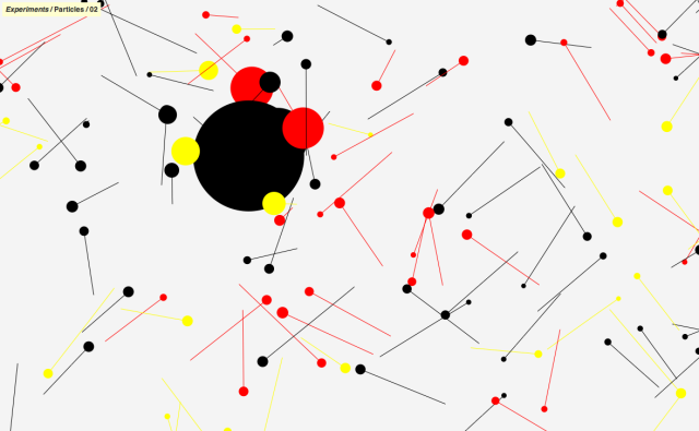
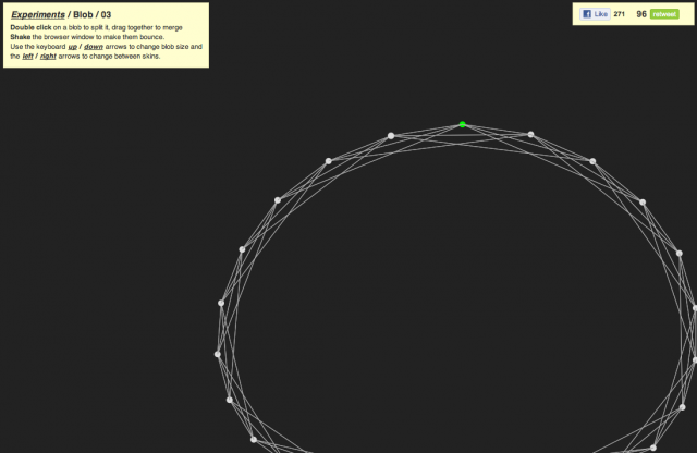
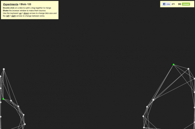
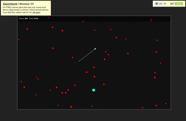
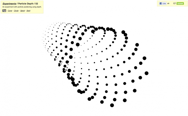
This is the personal playground of Hakim El Hattab, exploring what is possible using HTML5 and Canvas. Most recent addition includes Sinuous, a simple game built using canvas which will test your mouse pointer reflexes by having you direct your cursor against incoming meteors. My other personal favourites include Blob, Magnetic, Particle Depth and Particles.
Head over to hakim.se/experiments for some awesome HMTL5 fun or play with the code here.. Looking forward to see what’s next…
Hakim Experiments [Scripts, HMTL5] is a post from: CreativeApplications.Net | Follow us on Twitter – Facebook – Flickr – VimeoRelated Posts:
- Harmony [WebApp]
- the389 [Javascript]
- Multiuser Sketchpad [WebApp]
- 0to255 [WebApp]
- Pixuffle [WebApp, Photography]
- Temporary.cc [WebApp]
- Cartoon Network Enters the Grid
Launched in 1992 by Atlanta-based Turner Broadcasting, the Cartoon Network was a godsend to, well, cartoon lovers with 24-hour cartoon programming, mostly re-runs. In the past few years, with original series and its hipster- and geek-attracting Adult Swim block in the wee hours of the night, Cartoon Network (CN) has become one of the most attractive and genuine channels on television. From its humble beginnings, CN is now broadcast in 166 countries. But its identity has been a little wobbly in the last two years or so with an initial switch from the well-known checkerboard logo to a short-lived, perspective acronym that, I’m guessing, didn’t fair too well as it just got shelved earlier this year when CN started to run a new on-air identity in May, designed by animation powerhouse Brand New School in collaboration with the talented in-house team at CN. This week a new range of on-air identity applications started to roll out.
The network chose to embrace its brand visual heritage of the black and white checkerboard by imbuing it with new meaning, and the artists and producers of BNS were able to bring this idea to life in a fresh, compelling way using dimension, color and movement. All the new design elements began appearing in late May, and the new on-air IDs premiered on the network this week.
“Our brand expansion represents our commitment to delivering a breadth of content that our audience cannot find anywhere else,” said Senior Vice President of Creative Direction, Michael Ouweleen. “The checkerboard is in our DNA and is not only reflected in the subtle redesign of the logo but also provides a through line that connects and helps frame our diverse slate of programming from animation to live-action. The art direction and creative acumen of the Brand New School and their ability to breathe new into the iconic was invaluable and helped us achieve our goal.”
— Press Release
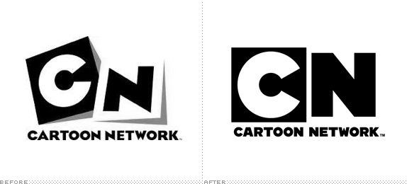
The before-before logo, with the well-known checkerboard design.
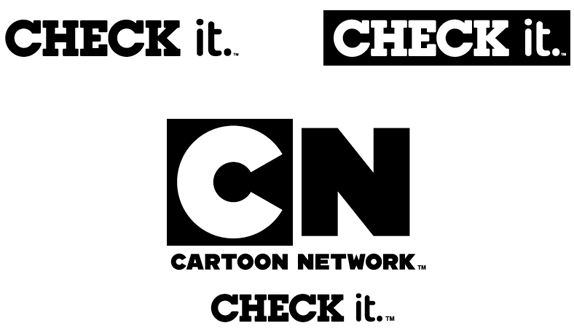
“CHECK it” tagline and lock-up with logo.
When I first saw the perspective logo submitted as a tip I didn’t post it because, even at that time, I felt like it was maybe just a “phase.” There didn’t seem to be longevity attached to it. What I didn’t like about it is that it screamed “Cartoons!” whereas the old and new ones are just identifiers for the cartoons themselves, they don’t have to act like cartoons. So it’s very nice to see CN pull back and go back to what made the original logo more successful. There are no magic revelations in the new logo. It’s the old “C” and “N” pulled out of the original, blown up and put side to side. Simple.
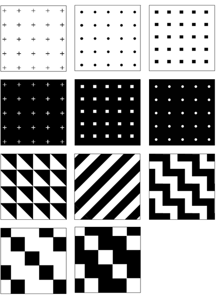
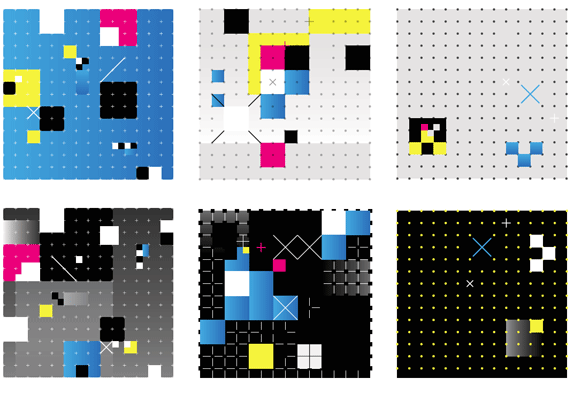
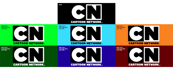
Black-and-white and color patterns.
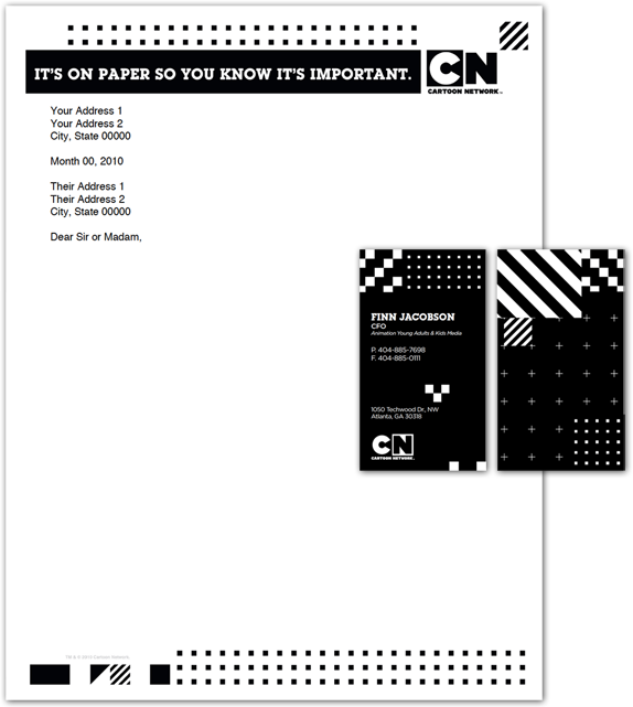
Stationery.
Show icons.
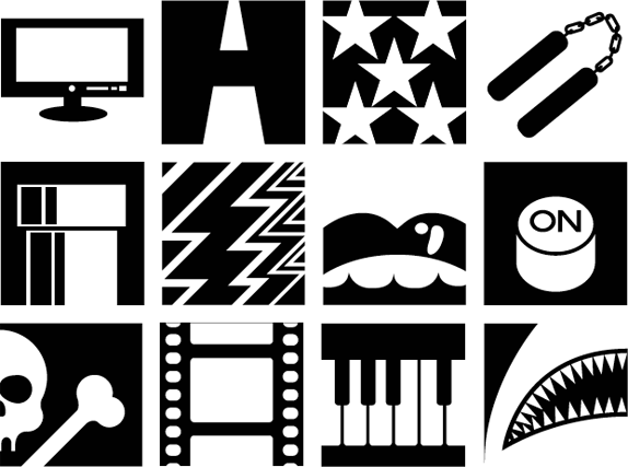
Lifestyle icons.
The new identity is surprisingly basic in its visual elements: CMYK colors, dots, crosses, squares, a grid. Yet the applications are playfully complex and versatile. Giving CN a broad range of possible executions without feeling too repetitive.
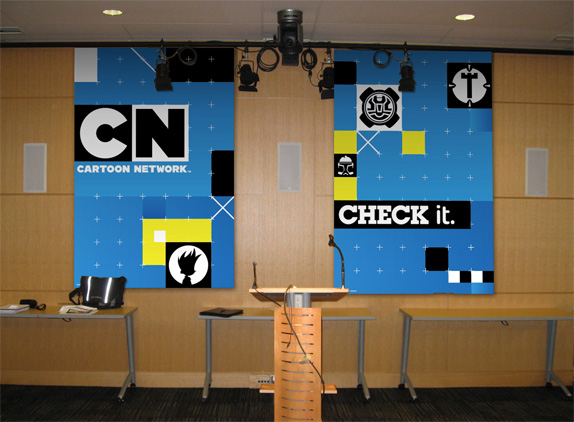
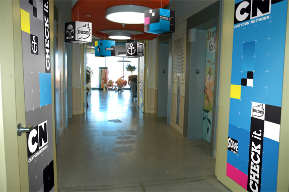
Office application renderings.
And when it comes to the visual pyrotechnics of on-air animation… good luck getting bored by it.
“Because we’d created such a gridded and structured designs for the overall approach, it became imperative that the movement of these pieces felt snappy, fast-paced, and above all, playful and full of life,” said Calvert. “Our animators developed a language that’s rooted in familiar physical interactions, but caricatured and amplified into something incredibly captivating and energetic.”
— Press ReleaseMontage from Cartoon Network’s 2010 On-Air Brand Expansion from Brand New School on Vimeo.
- New solar energy conversion process could reduce the costs of solar energy production enough for it to compete with oil
Stanford University engineers have figured out how to simultaneously use the light and heat of the sun to generate electricity in a way that could make solar power production more than twice as efficient as existing methods and potentially cheap enough to compete with oil.

A small PETE device made with cesium-coated gallium nitride glows while being tested inside an ultra-high vacuum chamber. The tests proved that the process simultaneously converted light and heat energy into electrical current.
Called “photon enhanced thermionic emission,” or PETE, the process promises to surpass the efficiency of existing photovoltaic and thermal conversion technologies.
Most photovoltaic cells, such as those used in rooftop solar panels, use the semiconducting material silicon to convert the energy from photons of light to electricity. But the cells can only use a portion of the light spectrum, with the rest just generating heat.
This heat from unused sunlight and inefficiencies in the cells themselves account for a loss of more than 50 percent of the initial solar energy reaching the cell.
If this wasted heat energy could somehow be harvested, solar cells could be much more efficient. The problem has been that high temperatures are necessary to power heat-based conversion systems, yet solar cell efficiency rapidly decreases at higher temperatures.
Combining light and heat could almost triple efficiency
A group headed by Nick Melosh, assistant professor of materials science and engineering, figured out that by coating a piece of semiconducting material with a thin layer of the metal cesium, it made the material able to use both light and heat to generate electricity.
Melosh is senior author of a paper describing the tests the researchers conducted. It was published online Aug. 1 in Nature Materials.
“What we’ve demonstrated is a new physical process that is not based on standard photovoltaic mechanisms, but can give you a photovoltaic-like response at very high temperatures,” Melosh said. “In fact, it works better at higher temperatures. The higher the better.”
Melosh calculates the PETE process can get to 50 percent efficiency or more under solar concentration, but if combined with a thermal conversion cycle, could reach 55 or even 60 percent – almost triple the efficiency of existing systems.
“The PETE process could really give the feasibility of solar power a big boost,” Melosh said. “Even if we don’t achieve perfect efficiency, let’s say we give a 10 percent boost to the efficiency of solar conversion, going from 20 percent efficiency to 30 percent, that is still a 50 percent increase overall.”
And that is still a big enough increase that it could make solar energy competitive with oil.
The research was largely funded by the Global Climate and Energy Project at Stanford and the Stanford Institute for Materials and Energy Science, which is a joint venture of Stanford and SLAC National Accelerator Laboratory, with additional support from the Department of Energy and the Defense Advanced Research Projects Agency.
More info: Stanford University news
- Eric Schmidt: Every 2 Days We Create As Much Information As We Did Up To 2003
Every two days now we create as much information as we did from the dawn of civilization up until 2003, according to Google CEO Eric Schmidt — about five exabytes of data.
He cautioned that just because companies like his can do all sorts of things with this information, the more pressing question now is if they should. Schmidt noted that while technology is neutral, he doesn’t believe people are ready for what’s coming.
“I spend most of my time assuming the world is not ready for the technology revolution that will be happening to them soon,” Schmidt said.
- Market Data Firm Spots the Tracks of Bizarre Robot Traders
Nanex, the data services firm, has discovered mysterious and possibly nefarious trading algorithms are operating every minute of every day in the nation’s stock exchange. Unknown entities for unknown reasons are sending thousands of orders a second through the electronic stock exchanges with no intent to actually trade.
Often, the buy or sell prices that they are offering are so far from the market price that there’s no way they’d ever be part of a trade. The bots sketch out odd patterns with their orders, leaving patterns in the data that are largely invisible to market participants.
The company’s software engineer Jeffrey Donovan thinks that the odd algorithms are just a way of introducing noise into the works. Other firms have to deal with that noise, but the originating entity can easily filter it out because they know what they did. Perhaps that gives them an advantage of some milliseconds.

Software engineer Jeffrey Donovan stared and stared at the data. He began to think that he could see odd patterns emerge from the numbers. He had a hunch that if he plotted the action around a stock sequentially at the millisecond range, he'd find something. When he tried it, he was blown away by the pattern. He called it "The Knife." (Nanex)
- Blippy Has Pretty Much The Best 404 Page Ever. What Does It Mean?
<
Creating 404 pages (the error page you get when a page on a site cannot be located) has become something of an artform. Startups can earn major bonus points in the geek community for having a humorous one. And Blippy has just tapped a perfect meme for their’s.
As you can see here, Blippy’s 404 page features a glorious rainbow. And while it’s not exactly a double rainbow, the cute unicorn child creature seems to think it may be. “What does it mean…,” he wonders.
Well if you click on him, you can find out…
It’s a double rainbow all the way!
Keep clicking…
OMG A TRIPLE RAINBOW!
As a sidenote, some people may think Twitter has the most famous 404 page these days with the Fail Whale. But that’s not actually a 404 error. Technically, the Fail Whale is a 503: Service Unavailable, error. The Twitter 404 page is much less exciting (below).

The personal website of Alex Weber
