- Visualizing Bloodtests
We were happy to win a design competition in Wired US this month.
It was around re-envisioning medical data. Specifically, blood test results. Which suck, design-wise. They still look like secret missives from the CIA circa 1965. Yet their contents are vitally – perhaps mortally – important.
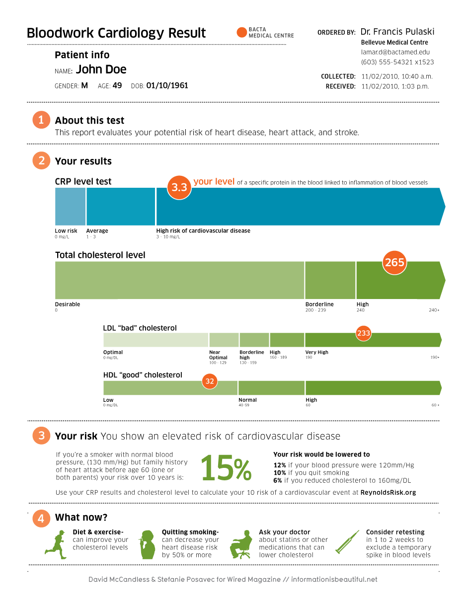
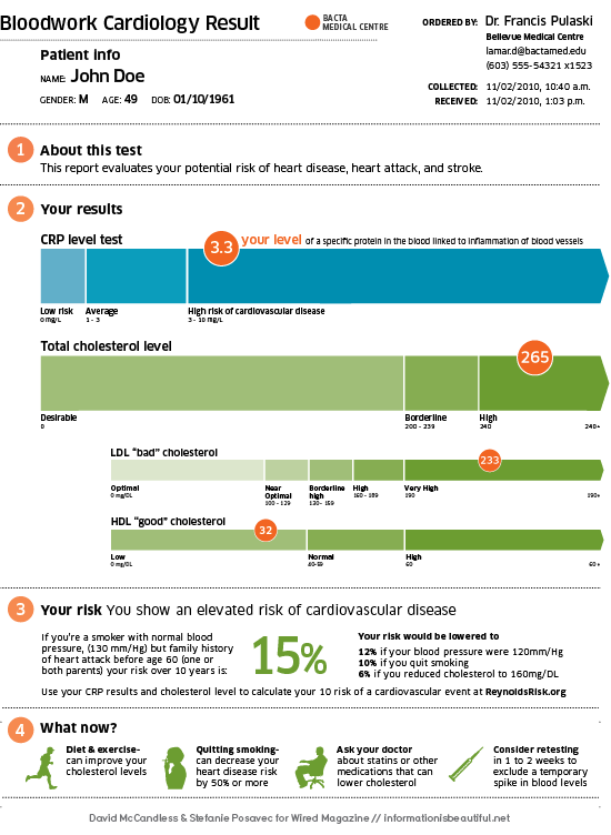
Our challenge was to approach a cholesterol level test. First it looked like this.

Then we designed it thus:
Our goal wasn’t just a polish job. We worked hard on the information too. So there was context for all the facts and figures. Ideally, anyone, of any educational background, could get the gist and plan their next move.See a hi-res version here. Or download a PDF.
(The image is creative commons. All non-commercial use is cool.)
Great work too from Mucca Design and Jung Und Wenig
DESIGN & RESEARCH: David McCandless & Stefanie Posavec
ADDITIONAL DESIGN: Stefanie Posavec, Joe Swainson
CREATIVE DIRECTOR: Tim Leong @ Wired


The personal website of Alex Weber